I recently received some post-graduation survey results from my class of 2013 about salaries, job satisfaction, and other things. I thought I’d try to visualize the data using R and ggplot2 as an exercise.
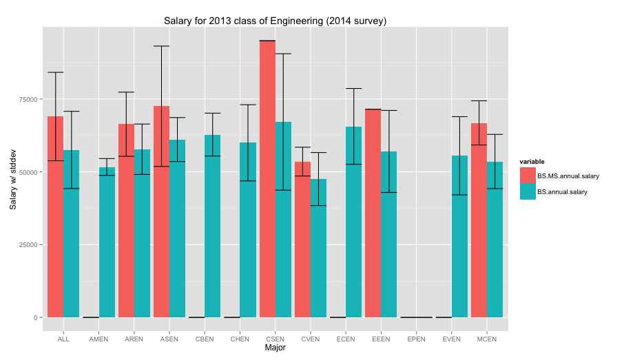
Figure 1. The fancy ggplot2 graph of salaries with standard deviation bars comparing salaries of BS/MS grads (red) with BS grads (blue).
As a CS grad, I suppose I’m happy to see that we have the highest average salary right out of the gate. CS also has a high standard deviation which I thought was interesting. Perhaps CS majors work in a myriad of fields that demand computational skills where other engineering majors may be more focused on certain types of fields, giving less deviation.
In the process of making this graph, I was looking for how to do the side-by-side bar charts in ggplot and ended up supplying a “correction” to an answer on crossvalidated, a stackexchange site. The correction entailed how the syntax for using reshape2 vs reshape has changed slightly, so hopefully that helps other people searching for the same issue.
Here is the code for processing
library ( xlsx )
library ( ggplot2 )
library ( reshape2 )
salaries = read.xlsx ( "workbook.xlsx" , 1 )
df = melt ( salaries , measure.vars = c ( "BS.MS.annual.salary" ,
"BS.annual.salary" ))
#awkward step to merge standard deviations
df [ df $ variable == "BS.MS.annual.salary" , "stdev" ] = df [ df $ variable == "BS.MS.annual.salary" , "stdev.1" ]
ggplot ( df , aes ( NA. , value , fill = variable )) +
geom_bar ( position = "dodge" , stat = "identity" ) +
geom_errorbar ( aes ( ymin = value - stdev , ymax = value + stdev ),
position = position_dodge ( width = 0.9 )) +
ggtitle ( "Salary for 2013 class of Engineering (2014 survey)" ) +
xlab ( "Major" ) +
ylab ( "Salary w/ stddev" )
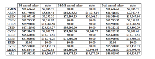
Table pictured